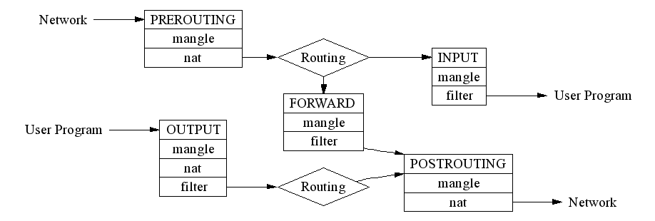
I decided to shamelessly "borrow" a diagram that I used a lot lately. A diagram that shows how the various tables are traversed by IP packets as the Linux kernel processes them.
There is, in fact, a much shinier looking version of this table in circulation, but in my experience, it's incorrect. This more pedestrian version, on the other hand, seems accurate, and was extremely helpful as I was trying to debug an OpenVPN connection issue:

I found the original (along with the shinier, but less accurate version) here.


